


Designing Clarity Into Rostering
UX case study for a digital rostering platform supporting clinical staff across Northland hospitals.

Project Overview
Background:
The Reggie application, developed by Te Whatu Ora (Health New Zealand), was designed to manage staff bookings and shift assignments for healthcare workers — improving roster gap visibility and significantly reducing the time spent on rostering.
The core objectives:
Improve the staff scheduling process across various healthcare departments
Creating an intuitive interface for roster builders and staff members
Developing mobile functionality for shift management and requests

Role UX Designer (solo)
Team Product Owner, Developers, BAs
Users Clinical & admin healthcare staff
Tools Figma, Miro, Jira
Timeline Jan 2024–Current

The story begins…

The Challenge
Rostering in healthcare is often messy and manual. Staff write their shift requests on paper, and managers have to manually enter everything into a spreadsheet. But as soon as the roster goes live, it’s already out of date — shifts get swapped, people call in sick, and changes start piling up.

Staff Problem:
The manual rostering process created confusion, stress, and extra admin. Staff found it difficult to view upcoming shifts, see where they were meant to be working, or understand what tasks they were assigned to. Swapping shifts was also complicated and relied on back-and-forth messages or paper trails, often leading to miscommunication.

Hospital Problem:
Rosters were managed manually using paper and Excel sheets, which made it difficult for managers to get a clear view of staffing gaps, sick leave trends, or who was being assigned high-value shifts. There was also limited transparency around potential favouritism, as nurses and doctors receive additional pay for working public holidays.


“Even I don’t trust my staff are rostered correctly.”
– Clinical Nurse Manager

Confusion to Confidence

Discovery & Research
Competitor analysis
At the start, I explored a range of digital rostering tools used in healthcare to understand common features and UX patterns. But through interviews and observation, it became clear that the real competitor wasn’t another app — it was Excel. That’s what staff were using day-to-day, and that’s what Reggie needed to outperform in clarity, flexibility, and trust.

Excel
Who am I actually designing for?
During our research I identified three user groups that our product will focus on:
Staff
“I want to easily see when and where I'm working, what days I have off, and be able to pick up extra shifts if I choose to.”
Pain points:
Having to seek out the manager for swapping shifts and getting approvals
Opportunity:
Implemented a feature that lets staff select a shift they’d like to swap, which is then sent to all other staff on the ward. Once someone accepts the shift, the manager simply needs to click approve — streamlining the entire swap process

Social Schedules
Managers
“I need to streamline the rostering process and quickly identify any shifts that still require cover.”
Pain points:
Having to collect everyone’s shift preferences and try to organise it on a roster
Opportunity:
Have a system where staff can easily select their preferred shifts and days off, and with one click, the manager can automatically generate the full roster in seconds.

Timble
Operations
“We need a system that actually gives us useful data to act on, not just spreadsheets.”
Pain points:
Not having oversite on any staff patterns or any unconscious based rostering to certain staff.
Opportunity:
Built a series of graphs and reports to visualise roster data, helping operations make informed decisions around staffing, leave trends, and shift distribution.

Understanding the elements
I dived deep into understanding the essential elements needed to build an effective rostering system. Starting from scratch meant defining the core components that would shape how the roster functions and feels for users. By identifying these key features early on, I set the foundation for creating a streamlined and personalised rostering experience that meets the diverse needs of both staff and managers.


Wireframes
1. Mobile home page

At a glance, users can see today’s date, their next shift, and any available shifts to pick up — all without needing to navigate to another page.
2. Roster list view

If users prefer, they can switch to a list view to see their upcoming shifts and the type of each shift at a glance.
3. Roster calendar view

Displays the same information as the list view, but in a calendar format — giving users a clearer overview of upcoming weeks and months, making it easier to plan weekends and time off with family.

Final Designs
Bringing It All Together

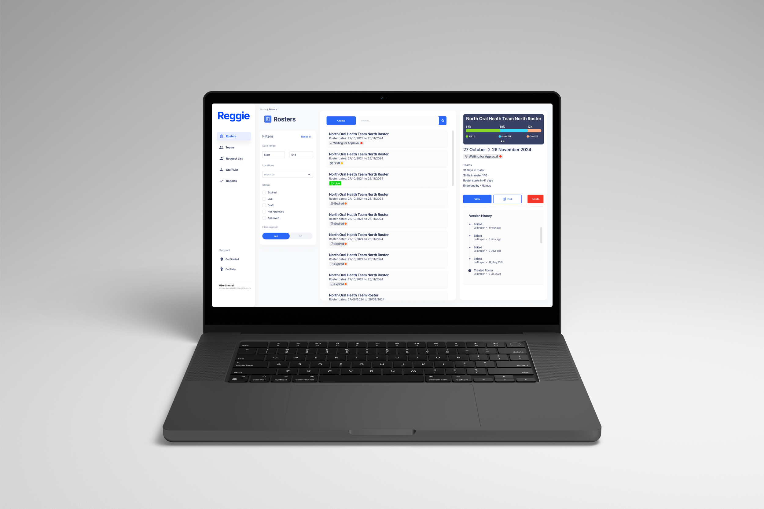
Roster Application
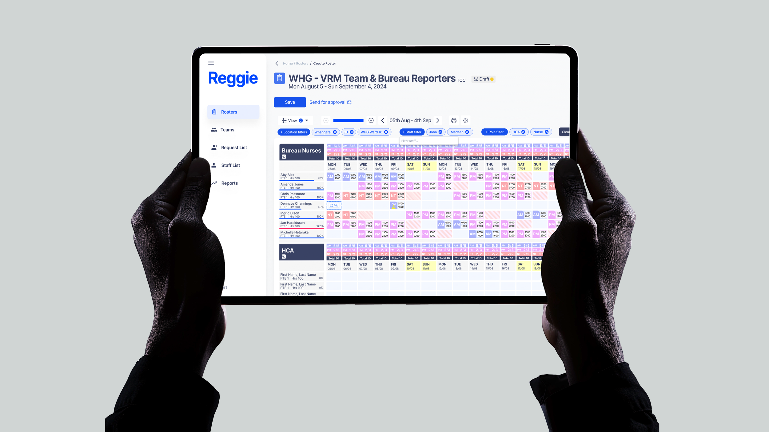

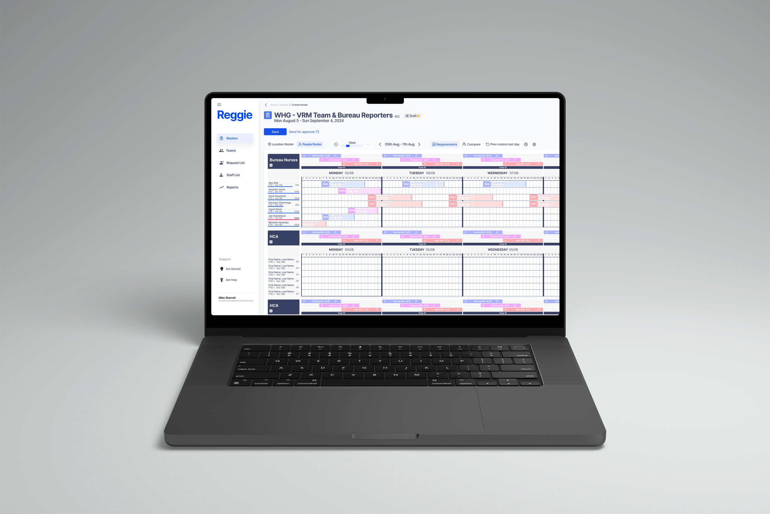


Dentist Supervisor
“I love how easy it is to click and drag shifts — it makes adjusting the roster so much quicker.”
Clinical Nurse Manager - Ward 14
“Creating draft rosters is so much easier now - it’s saved me at least half the time.”

Staff Phone App
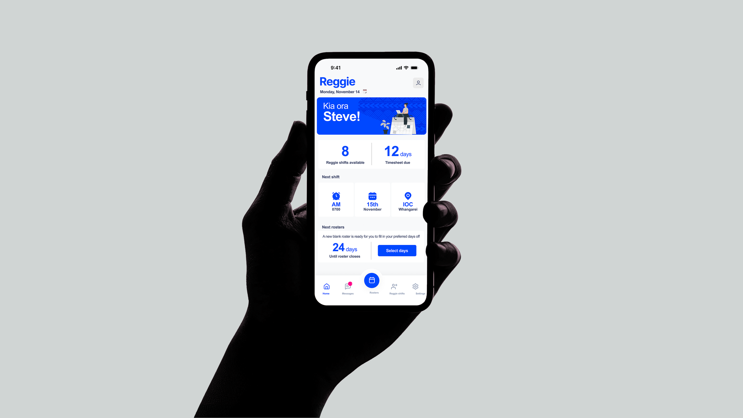

Nurse - Ward 2
It’s made such a difference — I actually know where I’m working, who I’m with, and I can plan my life without constantly second-guessing the roster.


Project constraints
One of the biggest challenges I faced was working within a fixed Statement of Work (SOW) that had already been signed between the hospital management and the external development team before I joined the project. The developers were contracted on a set payment for a defined scope, which meant that any new features or improvements — no matter how valuable from a UX perspective — were considered out of scope.
This created tension between what users needed and what could actually be built. Even small changes required negotiation, justification, and sometimes compromise. It pushed me to prioritise ruthlessly, advocate strongly for the most critical user needs, and find creative ways to improve the experience without disrupting the agreed scope.
